G+ died in slow motion. There were redesigns people hated. Tweaks and changes throughout its life, as Google tried to make it work the way they wanted. The site was shuttered in April 2019. The social network was never the hit Google wanted, but it was a weirdly popular RPG space—certainly the epicentre of the best parts of the OSR for a period of time. People never stopped posting, right up until the end.
I remember seeing pictures of Mörk Borg in the dying days of G+ and knowing I wanted it despite not knowing what it even was. Despite it being written in Swedish.
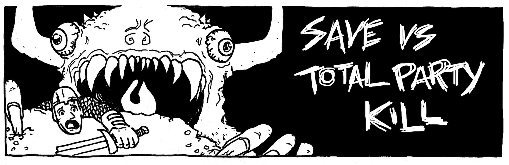
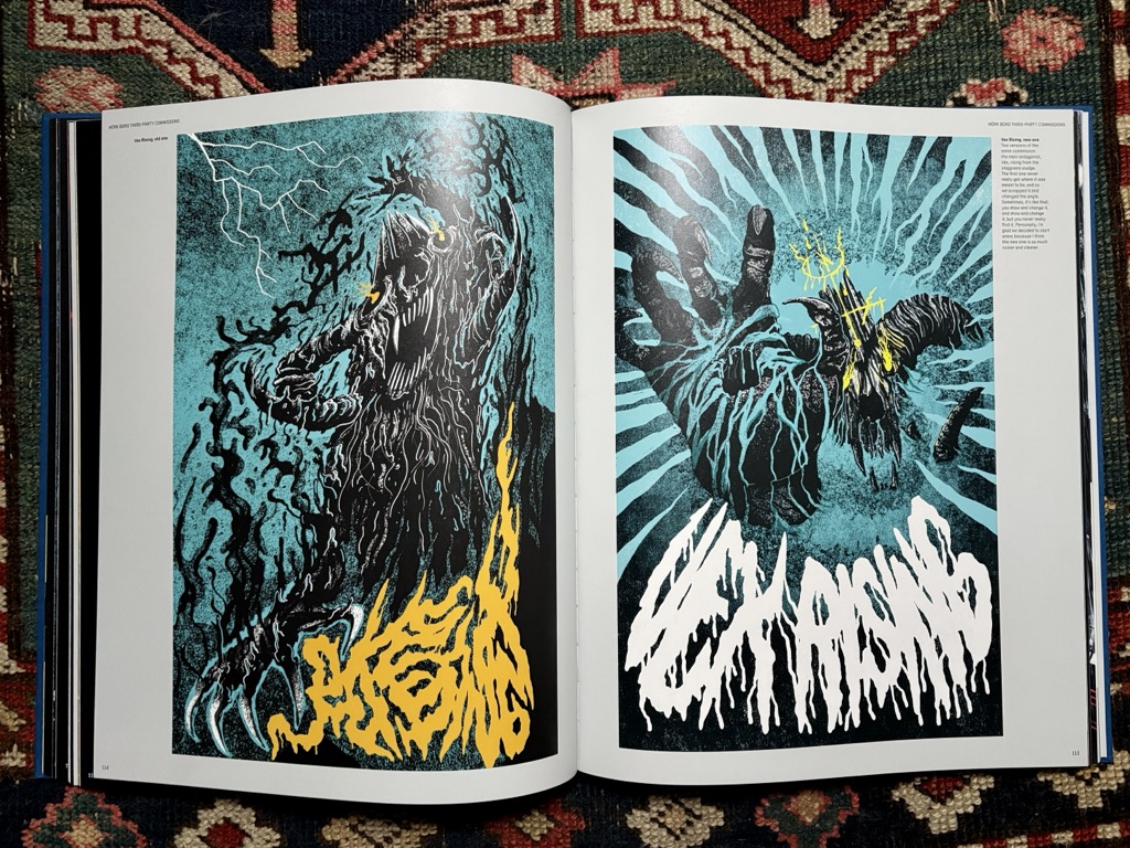
There is lots of love about Mörk Borg, but I believe a large part of its success is due to the bananas art and graphic design of Johan Nohr. Clayton Notestine has written at length about what makes Mörk Borg’s graphic design so fantastic, so I don’t have to. I get annoyed when people are dismissive of Mörk Borg’s graphic design. You can flip to the back of the book and see the adventure Johan laid out: neat, tidy and functional. Clearly he could have made the whole book like that if he wanted to. The excitement on the page is a choice. I digress.
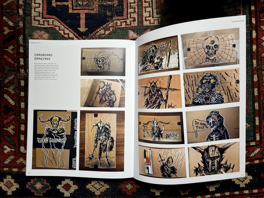
Johan has produced a lot of art for the RPG scene since my first encounters with his work. He did the graphic design and art for Into the Odd’s fancy edition, showing the world he isn’t a one trick pony. He did the graphic design for CY_BORG, showing the world he can make something that feels cohesive with Mörk Borg, while managing to be its own thing. He’s painted countless covers, pictures of dogs, pictures on cardboard. The man keeps himself busy.
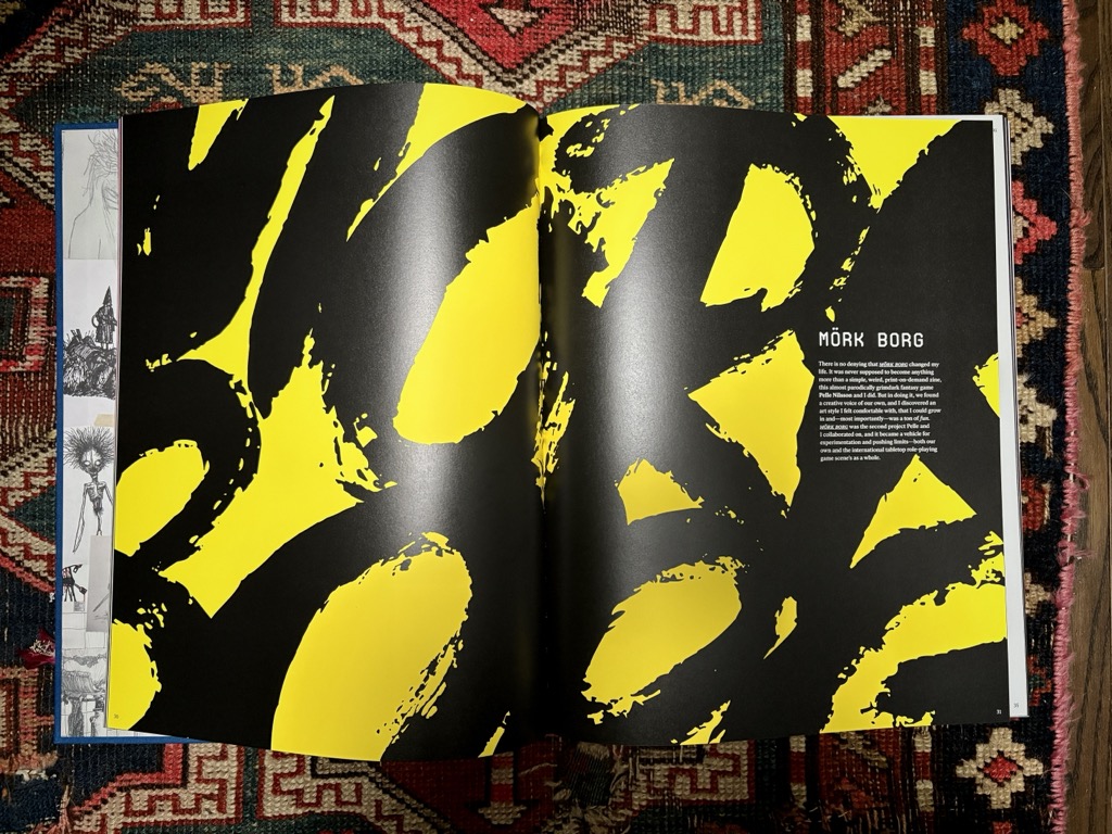
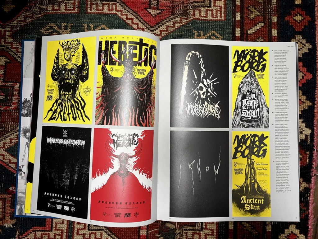
Art by Nohr is a chonky coffee table art book, collecting work from 2006 to 2023. The book was published via one of those kickstarters I backed without really thinking about any of the costs. I paid so much money to ship this book to my actual house. A heart breaking amount. If you know me you know I don’t ship fucking nothing to my house, shipping makes me crazy. I have books waiting for me across the globe, one day I’ll see them. But this book I was too hyped for.
The book is massive and beautiful. The sort of book you want to lay flat on your dining table and flip through slowly. As I write this post it’s sitting next to me, but I find I don’t actually have anything interesting to say. I love the intensity of Johan’s art. It’s interesting to see 20 years of work in one place. What else is worth talking about? The book is sitting on a shelf next to art books for Anders Zorn, Mary Cassatt and Helen McNicoll, and Denyse Thomasos. He keeps them good company.
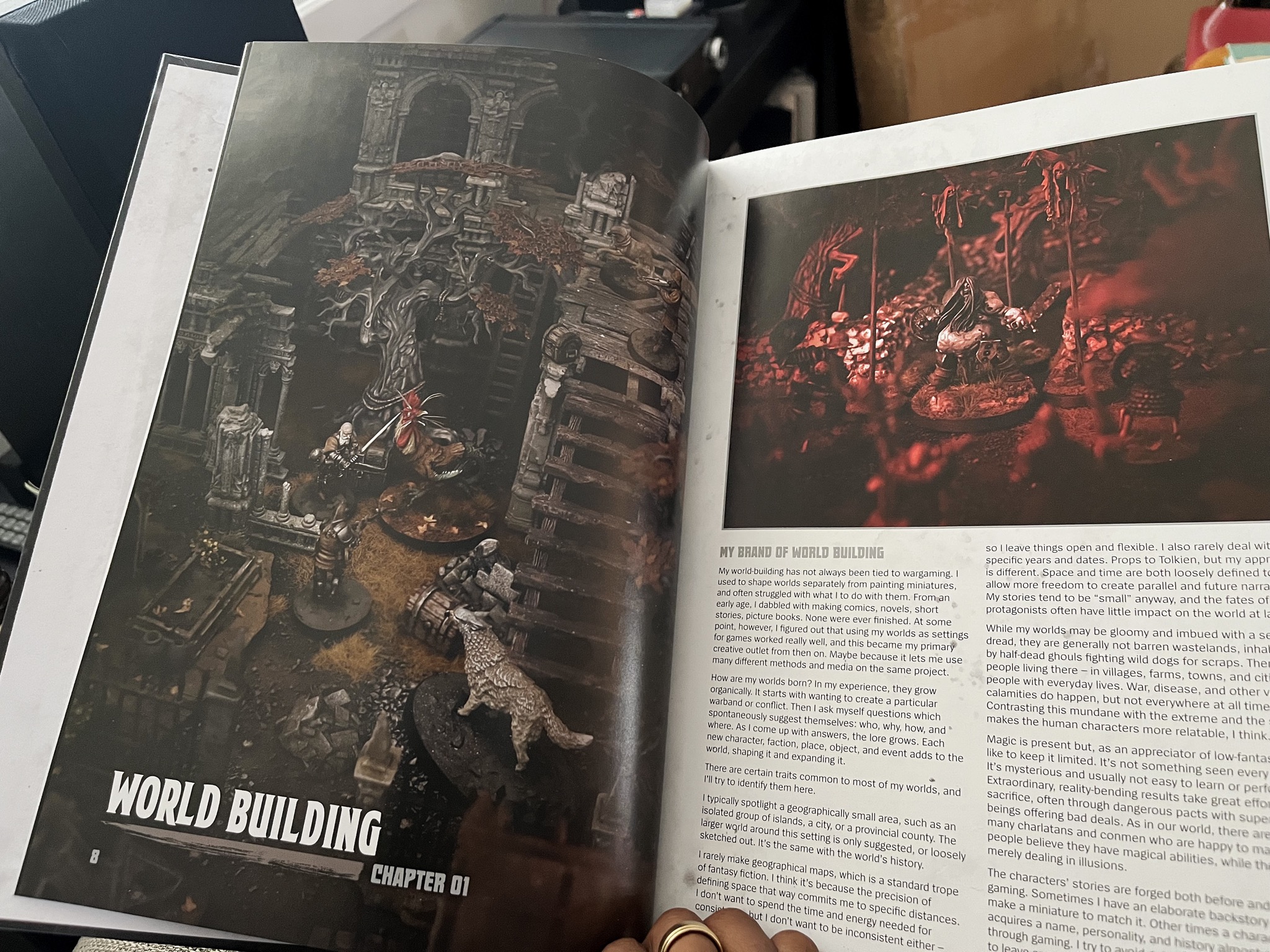
I was visiting my local game store and saw an art book featuring the work of Ana Polanšćak, the woman behind the incredible blog Gardens of Hecate. As part of the Inq28 scene, Ana produces some really unique and moody miniatures and war gaming ephemera. The art book chronicles her journey through the hobby, and is a real deep dive into her whole process when it comes to producing her work. A lot of the book is about how she thinks about world building, and is likely of interest to RPG nerds. There is a lot of overlap between narrative war gaming and RPGs, and Gardens of Hecate is the perfect example of that.
Patrick and Scrap are currently running a Kickstarter for the follow-up adventure to Deep Carbon Observatory, Demon-Bone Sarcophagus, so now seems as good a time as any to talk about their work. I like seeing them succeed. When I first reviewed Deep Carbon Observatory I had the following to say about Scrap’s work:
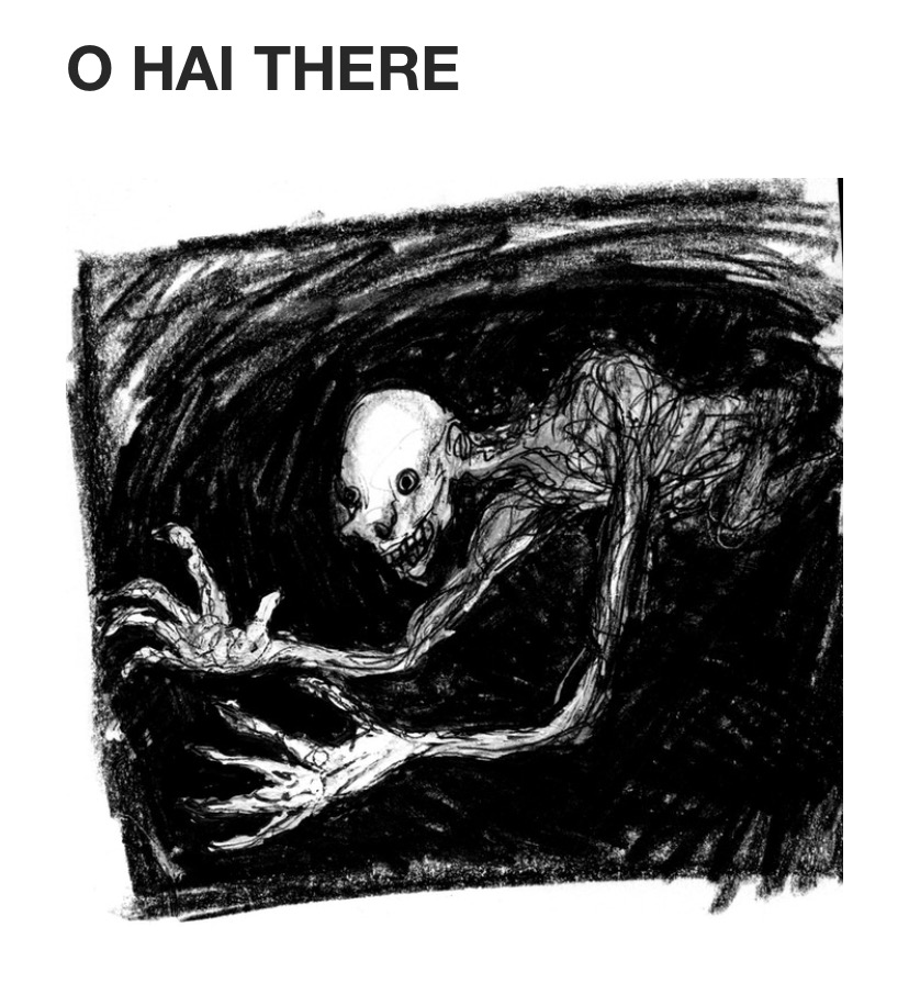
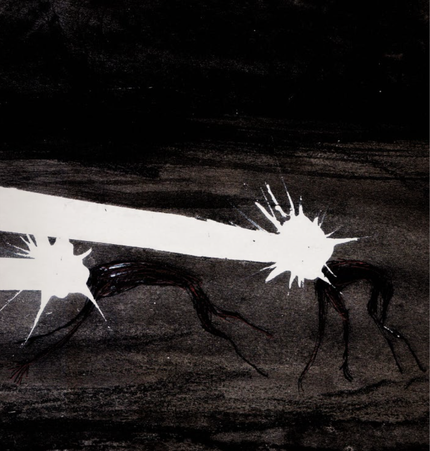
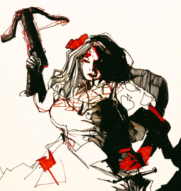
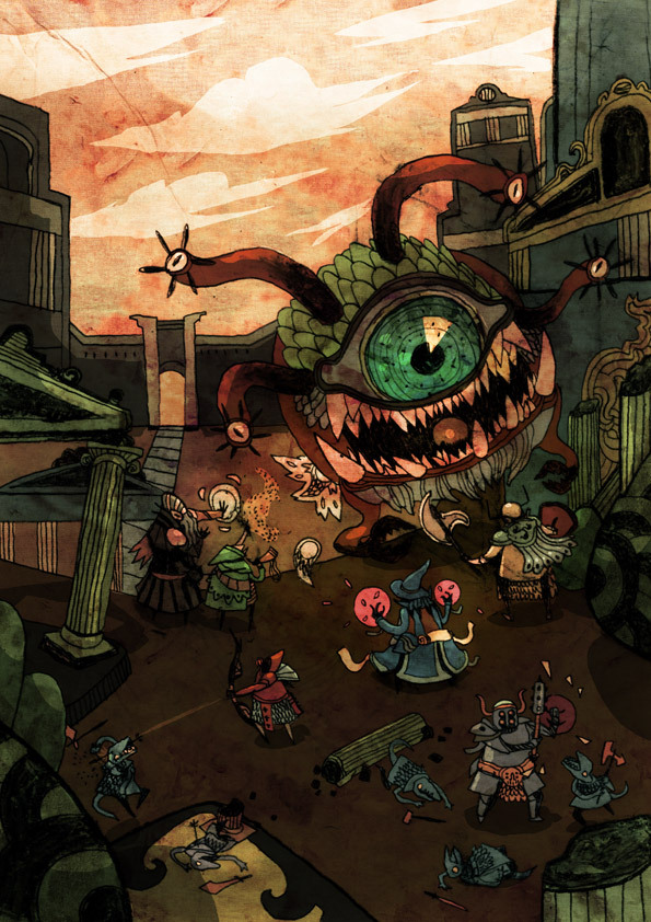
Scrap Princess’ illustrations contribute to the overall tone of the book. I find her work is so frenzied and terrifying. Maybe that’s not the right word, but there is something about how she draws that I find really visceral. I don’t know anyone else that draws like her.
All these years later, I still don’t know anyone who draws like her. How does she even draw?
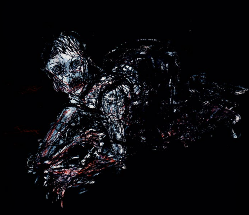
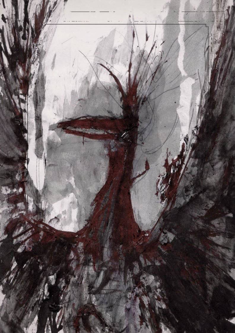
A few years later she would draw another favourite picture of mine, a picture of madness from Veins of the Earth. (Such an incredible book.) The picture feels like an evolution of the giant. I asked Scrap if that was her intention and she said, “Nope. (Other than its horrible and in a cave?)”
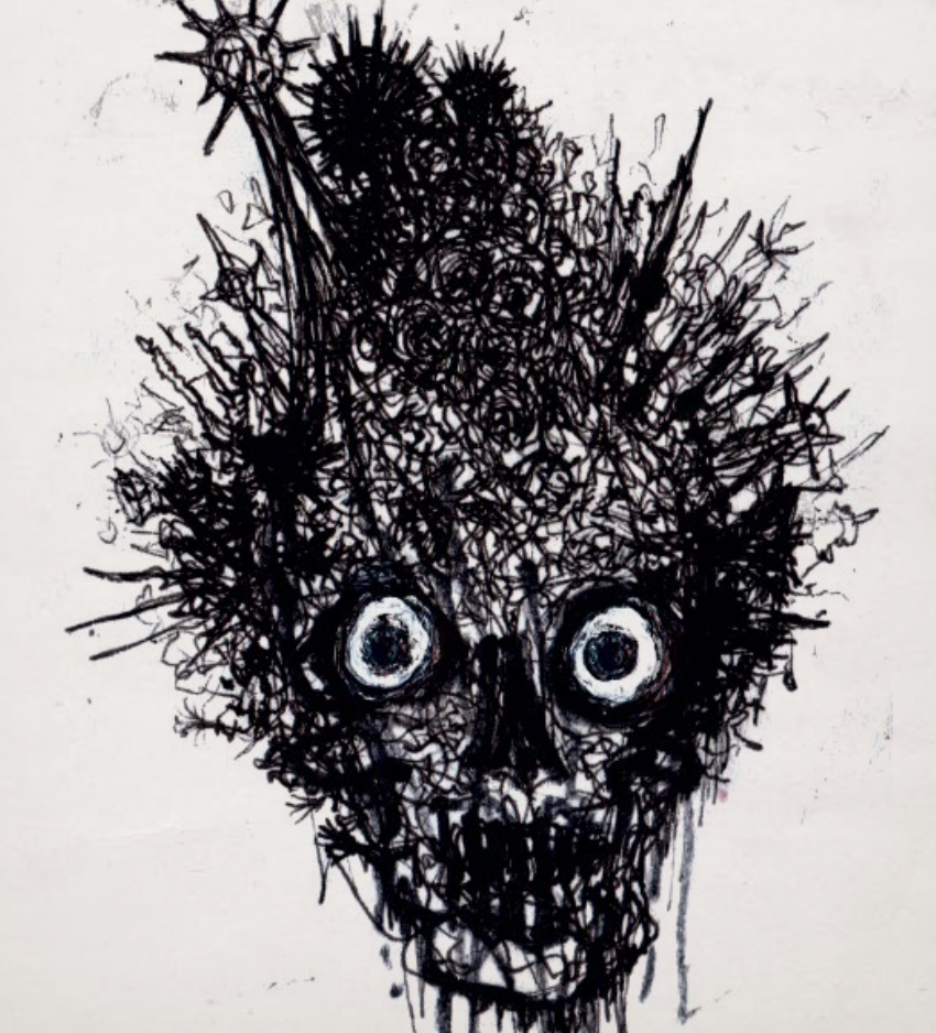
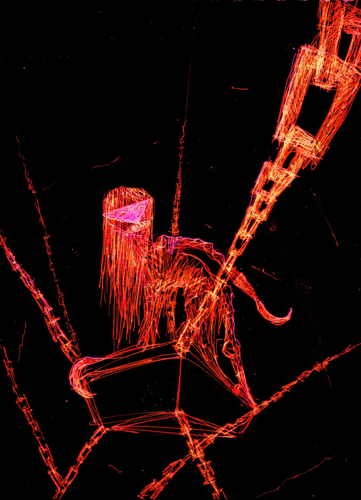
People will often denigrate Scrap’s art as scribbles. Which, on the one hand, sure, but there is clearly more going on. I don’t scribble this good. These eyes are piercing. The line work of her drawings feels frantic. It has an energy that feels charged. On Twitter, Warren D summed things up nicely: “I always emotionally respond to Scrap’s art before I finish consciously visually processing it; ‘feel’ it before I ‘see’ it. Most WotC art I see quickly and feel nothing.”
Fire on the Velvet Horizon is likely peak scribbling Scrap, but maybe also highlights what you can capture in such minimalist drawings. The history of that project is interesting. While Vein of the Earth was stuck in the miasma of layout and production, Scrap and Patrick worked on this monster book. Scrap mailed Patrick drawings and sketches, and he would turn them into monsters.
The thing about Velvet Horizon that gets overlooked, constantly, is that I chose a wide range of drawings to send to Patrick, and that variety included extremely loose sketches, more developed drawings, stuff I thought was bad, stuff I thought was good. Then whatever he responded to , he responded to, and that drawing would then go into the book. However there’s like a few entries where what he responded to was such a bizarrely small and brief drawing that I chose to draw a new drawing to go on that page, but I believe in every case the responded-to drawing is also on there too. There’s a few where the drawing responded to was something in the margins or on the back of another drawing, and I hadn’t even expected those scribbles to be up for consideration. That was all part of the experiment of that book.
I asked Scrap if she was like Picasso and could draw perfectly but decided that was boring. She laughed in my face. (Well, virtually.) She then went on to say:
Trying to get the hang of basics does inform my scribble style. It’s been an ongoing process of trying to draw conventionally or at least do the basics, turning out bad ugly drawings, but in the process of improving that skill, my gestural style improves as well.
Why does she draw the way she does? We can just ask her:
What has made my drawing looking like how it does is that I really struggle with the basics, especially anything informed by methodicalness and close observation. At some point in high school me and a friend were drawing our own illustrations on a print out of fairly broken fighting game rpg someone had downloaded from the early internet. I was trying to draw conventionally and it was turning out bad, and he was just going for it doing these crazy scribbles and they turned out amazing. Even when they didn’t look like what they were meant to , they still were hilarious. It was at that point that I realized if I just cut loose and scribbled and then tried to turn it into something , it would have much better results.
Veins on the Earth and her later books feature a bigger variety of types of art, but everything she does is always more abstract and impressionistic than your typical RPG drawing. The Blink Dogs and the Anitpheonix from that book are a couple of my favourite examples of her not-scribbling style.
Scrap isn’t active on social media, but that doesn’t mean we should Forget about D.R.E. This post mostly exists to share some of her art, and maybe introduce her to people who weren’t around on G+ when she was more active in “the scene”. To get back to where we started, enjoy this picture from their latest Kickstarter.
Wife is now fooling around on the tablet I bought so I have email access when traveling. It has the Alice in Wonderland books preloaded on it and she is amazed.
Me, I’m suddenly struck by the idea of putting a young blonde in a blue dress on the cover of an adventure I’d call “Eat Me.” — James Raggi, August 23rd, 2012
A little over two years ago James Raggi mentioned in passing this idea of doing an Alice in Wonderland Adventure. Zak S replied with a phrase that became a bit of a joke on G+: “For a modest advance…" Presumably there was a modest advance, because here we are.
Zak would occasionally share bit and pieces of the book he was working on on his blog: artwork he had finished, or a table or set of rules he had written. I helped play test the module a few times: once with my OD&D group, a couple times with Zak himself, and most recently with Rebecca just as the final layout for the book was wrapping up. Zak used a photograph of me as a reference for the Knave of Hearts, after asking for photographs on G+. I have been watching in real time as this book slowly came together. I bring this all up to try and highlight just how much I have been anticipating this book, how completely unrealistic and unfair the expectations I have placed on the final product are, and to suggest that I am perhaps too emotionally invested in this book to review it properly.
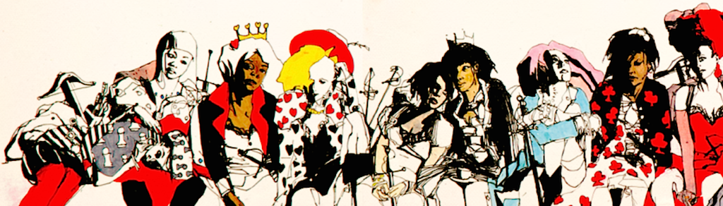
A Red and Pleasant Land is a setting book that describes Voivodja, the Land of Unreason. Rather than using the travel guide gazetteer format commonly used for these sorts of things—which, if we are being honest with one another, suck—A Red and Pleasant Land presents its world primarily via elements that are all usable at the gaming table: dungeons, monsters, new rules, and random tables. A Red and Pleasant Land is more about helping a DM build their own version of Voivodja than presenting some canonical version of the place. In this way is reminds me of Carcosa.
A Red and Pleasant Land begins with a brief overview Voivodja. It’s 18 pages long and is probably the only part of the book you’d be expected to read beforehand if you wanted to run things by the seat of your pants. The book starts off with a discussion of what makes this place different than your typical fantasy setting. The history, geography, and culture of Voivodja is examined at a very high level. Mixed in with all of this is advice on how to use the book and run a game in Voivodja: this is something more books should do. Much of this section of the book is adventure hook fodder. (Croquet, a staple of Alice in Wonderland, is presented as an obvious source of adventure: players might play to get an audience with the queen, be hired to track down a obscure wickets, etc.) Voivodja is a strange land where a king and queen have been waging war upon one another for time immemorial. Two other factions have decided to enter this fray, both deciding who to ally themselves with as the adventure begins. The setting is designed to support a game built around the conflict that comes from the players interacting with various NPCs with conflicting goals.
To go along with the new setting is a new character class, the Alice. The character is an interesting twist on the Specialist from LotFP. Every time the character gains a level a percentile die is rolled: this may lead to new powers or bonuses inspired by the events in Alice’s Adventures in Wonderland rather than simply gaining more skill points or saving throw improvements. The Alice also has the ability to get exasperated. Doing so lets them roll on an exasperation table, which may lead to the sorts of strange events, again clearly inspired by Alice’s Adventures in Wonderland: a door appearing out of nowhere, something that normally wouldn’t be able to talk suddenly starts talking, etc. I played an Alice during the play test for A Red and Pleasant Land, but didn’t take advantage of this power—i’m boring I suppose.
A look at the new monsters and NPCs of this world is up next. There are 4 factions in Voivodja, led by: the Heart Queen, the Red King, the Pale King, and the Colourless Queen. Beyond your typical stat block, almost all the creatures in this book have relationships or alliances that could lead to adventure and conflict. This also helps present the setting to the players. Most of the monsters in the book are quite interesting. I particularly liked the Guests, which are basically demons. A Red and Pleasant Land features a great random demon generator that you could steal for any fantasy game. There is also a Brown vampire: trés fantastique! There is an illustration for almost every creature presented. Hopefully you know what a horse looks like.
There are two dungeons presented in detail in A Red and Pleasant Land: the Heart Queen’s palace, and the Red King’s castle. They are both fucking bonkers. Of the two I love the Heart Queen’s castle the most. The games I have played exploring that dungeon have been some of the most fun I’ve had playing D&D. I think they are both well executed and interesting: big enough and weird enough to support multiple sessions of play.
The book concludes with some new rules and then some random tables. (Of course it does.) As I mentioned in my last post about A Red and Pleasant Land, Rebecca used these tables to generate an adventure for us to play more or less on the spot, without anyone really noticing what was going on. That seems like high praise for this portion of the book. My favourite title in the whole book is found in this section: “Idiotic Voivodja Filibuster Conversation Openers”. There are lots of great tables, many of which would work in other settings. All games need a “where have you been?” table for when a player shows up late or misses a session, and a good “I search the body” table can tell the players a lot about the world they playing in.
Like Vornheim, A Red and Pleasant Land is as much a book about a particular setting as it is a treatise on how one should go about writing and presenting a setting in general. Zak has clearly approached this problem from the perspective of someone sitting at a gaming table. How much information does the DM need to successfully run a campaign set in this world? How do you best present it all? What things need to be quickly referenced? These are questions that seem to be rarely asked by most authors and publishers, including Wizards of the Coast. This book is worth buying as an example of good graphic design, even if you aren’t interested in Dungeons and Dragons.
The two large dungeons presented in the books are a perfect example of this attention to detail when laying out a page of text. The map of the outer defences of the Red King’s castle, along with the descriptions of the rooms on the map, all fit on a two page spread. Most sections of this palace have cutaways maps along with descriptions that fit on one or two page spreads. Occasionally you will need to flip back a page to see a map, but this hardly feels onerous compared to the typical presentation of dungeons in most modules. Room descriptions are all bullet point rather than long paragraphs, making it easy to quickly figure out what’s going on. There is no superfluous text. This is true throughout the book. Blocks of text that might need to be looked at during a game are usually presented as bulleted lists, while sections of the book that will likely be read before or after a gaming session are often longer and more flowery.
This level of thoughtfulness permeates the whole book. There are next to no tables that don’t fit neatly on a single page, or aren’t part of a tidy two page spread. (The few tables that are too big for a two page spread are clearly marked as spilling over to the next page.) Beyond the dungeons and the rare monster, there is basically nothing in this book that would require you to flip a page to get all the information you need.
The layout of this book is really stunning. Jez Gordan has done an amazing job here. In addition to being so throughly functional the book looks beautiful.
This book is great. The artwork is amazing. The layout is amazing. The content is amazing. The physical book itself is amazing. I’m not sure why I even bothered writing this all up now. When it comes to gaming purchases this is a safe bet. Even if you have no interest in a D&D version of Alice in Wonderland, there is enough creativity here to steal or twist into something else.
Zak Smith made an art book that doubles as a D&D module. If nothing else it’d make a good coffee table book.
I started writing what follows weeks and weeks ago. I have been waiting—impatiently—for A Red and Pleasant Land, the new D&D supplement by Zak Smith. It’s here now, which makes dragging my feet to post this seem particularly dumb.
Several weeks ago I attended OSRCon 2014. I saw some familiar faces and met some new people. The event was low key and a lot of fun. There are lots of old school gamers in Toronto, but we rarely meet up.
I started the day with a game of Lamentations of the Flame Princess. Rebecca, of Dungeons and Donuts fame, ran an adventure using Zak Smith’s new module, A Red and Pleasant Land. This is Zak’s D&D take on Alice and Wonderland. The adventure is due out very soon. There is no other RPG book I am more excited about.
The game began as many do: a rich and mysterious benefactor promised the party riches beyond their wildest dreams if they would perform a series of tasks:
Clear out the knothole dungeon (an abandoned hangman’s post).
Map as much of Castle Cachtice as possible.
Ruin the hatter’s trial (“not guilty”).
The characters could make sense of the first task, as they were aware of the the location of the dungeon. The others were confusing: there is no Castle Cachtice and they had no idea who the hatter was. Still, what player is going to say no to tremendous wealth—especially when you are playing a one-shot?
Since this was OSRCon we began the adventure by carefully searching the area surrounding the entrance to the knothole dungeon. A dice roll later and the specialist had discovered a tiny key. Satisfied we were safe enough, we ventured down into the dungeon. We moved cautiously, coming upon a room with 3 dead bodies: two man sized, and one halfling sized. A few more dice rolls and we had discovered a few more curiosities.
As players we quickly realized that this module featured a pretty great “I Search the Body…” table. As the game progressed we could see that a lot of the work Rebecca was doing as a GM in this game involved working with random tables and interpreting their results for us. Since she didn’t have an actual book, but a giant ream of paper, this would sometimes slow things down as we waited for him to find his place or look up a result.
This sort of thing can be a lot of fun if the players understand what’s going on, and the delay adds something to the game. Rolling for random treasure is enjoyable because there is some anticipation about what you might find. We were making the rolls as players, so the flow of the game rested with us. By the time we finished futzing around with our dice Rebecca would be ready to read off the results of our roll. On the other hand, when Rebecca was rolling on random tables himself she doesn’t have this wiggle room and any delay stands out. I suspect she would have been fine had she added a few more post-it note bookmarks to his binder of paper. There seemed to be a few tables she was using regularly in the adventure. (An actual book is also much easier to flip through.) Depending on what tables were being consulted, rolling results before the game or simply reading the tables as lists might work as well to speed things up. I don’t think anyone found the delays particularly distracting. Most of the game moved smoothly so anything that didn’t is noticeable.
Re-reading the above, I was curious just how much or how little preparation work Rebecca did for this session. So, I asked him: “I actually ran that adventure with almost no prep. The first knothole dungeon before the castle was randomly generated on the spot.” Impressive! I thought Rebecca was using a table here or there, that I was catching every instance of him looking stuff up. Apparently I was just catching those moments where she wasn’t looking things up fast enough. Amazing. I’d have never guessed that first dungeon was something she hadn’t written up ahead of time. Of course, this books isn’t going to automatically make you better at improvisation and ad-libbing, but it certainly seems to be a good game aid to support that style of DMing.
We explored the dungeon, ended up “through the looking glass”, briefly met the Red Queen, and did manage to sabotage a trial—mostly, anyway. A lot of crazy stuff happened in between, but I really don’t want to spoil this setting for anyone else. There are a few elements of A Red and Pleasant Land that are so much fun when you first encounter them I would feel bad if I ruined that experience for anyone else who plans to play in this setting. I participated in the play tests that were happening when this book was in development, and it was a great experience because I knew almost nothing about what Zak was working on beyond the fact it was set in an Alice in Wonderland world. There is another big literary influence on this work, but I feel like not knowing what it is makes that reveal in the game all the more fun.
Rebecca ran a great session. It felt very much like something she would run crossed with something Zak would run—which makes sense I suppose. Zak has a very distinct style to his conception of D&D, and it really shines through in this setting. It’s a testament to the work she has done here that the adventure Rebecca ran and the adventure Zak ran during the playtest both had a similar vibe to them. Zak’s game didn’t feel anymore genuine or official than Rebecca’s.
All in all I have played 4 different sessions set in this world. As a player I have nothing but good things to say A Red and Pleasant Land.
I can read Zak’s book right now. I’ve already started doing that. The thing has a lot of hype to live up to. Perhaps unrealistic levels of hype. I don’t want to write about any of it till I can flip through the paper pages of this wonderful book.
Evlyn’s blog Le Chaudron Chromatique is full of amazing art. There is so much great stuff i’m not even sure what to point out. Their most recent post was a lovely illustration of the Marsh Enchantress. An earlier favourite of mine was this posse of fungus monsters. There’s also the occasional post full of DIY D&D nerdism. Most recently Evlyn reimagined Gnolls as Hammer Goats. This blog is great: check it out.
Basic D&D is more or less all I wanted in terms of 5th Edition Dungeons and Dragons. It’s nice and simple. Still, I wanted to give Mike Mearls and his team a high five for all the work they have done so I picked up a copy of the new Players Handbook yesterday. One aspect of the book really jumped out at me right away: damn there is a lot of art in this thing.
The team behind 5th Edition must have blown a sizable portion of their budget on art. This thing is overflowing with artwork. It’s rare to go more than a handful of pages before hitting a painting. Everything is in full colour. There is a bit too much of that “single character posing” artwork that seems to be most common in new RPG books, but on the whole I like this book’s art. I wish they had credited which artists painted which pictures. Maybe that’ll be something that ends up online, one day.
One nice change of pace compared to RPGs books of yore: women seem to be represented in the art more or less equally. In fact, there might be more girls than boys in this book. There’s also much more variety in terms of how people are represented in general. Suck it, White dudes in armour: we’re coming for you!
How was this feat achieved?
Hire lots of women. And hire gay dudes. And hire every kind of person because they make a talented version of every kind of person. They exist.
…
That is the sole and only answer that is fair and that will get us good work while sacrificing neither of the real priorities here.
Hire women (50%!) and let them do whatever they want. Don’t hire men and tell them to make work that does not appeal to them. Don’t hire a writer and ask him to write a world he will not want to play in. Hire a woman and ask her to do whatever.
Zak Smith has a great blog post about this (obvious?) idea from a couple years ago that’s worth re-reading. Unless i’m bad at guessing gender, it looks like 4 out of the 6 art directors for this book were women. I can’t imagine any other route to get to this book and its art that doesn’t involve women being directly involved in its production.
This painting is by Yannick Bouchard for the new LotFP Referee book. Is there anyone else putting out RPG art of the same calibre as Lamentations of the Flame Princess? Their Tumblr is full of amazing pieces of art work. They definitely out class Wizards of the Coast, which one would hope has a much bigger budget for this sort of thing. I often feel like all the good fantasy artists get sucked up into the behemoth that is Magic: The Gathering. It’s good to see that this isn’t always the case.
James Raggi sometimes gets flack for the art work he puts in his books. Sometimes people say they are too gruesome. Or they say they are too full of nakedness. I don’t think i’ve ever heard complaints they are too boring, though.
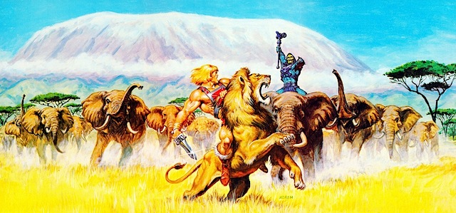
Last June I emailed my cousin, asking him if he could draw me a banner for this website. He can draw, and I can’t. And so I patiently waited. The old banner for this site was an image by Earl Norem. I love He-Man more than most anything, but it was very much a place holder for an image I new was on the way. Yesterday night I got an email saying he had finished drawing my banner. Now it’s time to write some blog posts.
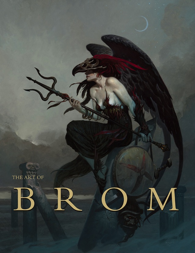
Gerald Brom’s art work shaped the way the Dark Sun game setting evolved. He would paint scenes that the game designers would then use as inspiration when building the world and the game mechanics that went with it. He has a very distinctive and I would say classic fantasy style. His work reminds me a little bit of the work of Frank Frazetta. He’s probably the greatest fantasy artist alive today–yeah I said it. He also has a Kickstarter project on right now to fund a retrospective book of his work. I’m losing my shit over here.
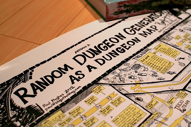
The Random Dungeon Generator as a Dungeon Map by Paul Hughes was the first D&D product I backed on Kickstarter. It’s really through this project that I ended up discovering the community that surrounds old-school D&D. I have since spent far more than I ever thought I would on other D&D crowd funded projects. There is something so earnest about these projects I just can’t resist.
The poster arrived today and it looks really great. It’s massive, so I’m not sure how well it would actually function as a game aid, but as a piece of art is is definitely cool. I really need to frame it so my wife tell me I can’t hang it up on our walls.